Nutty Corner · Published 60 days ago on 21 Aug 2026
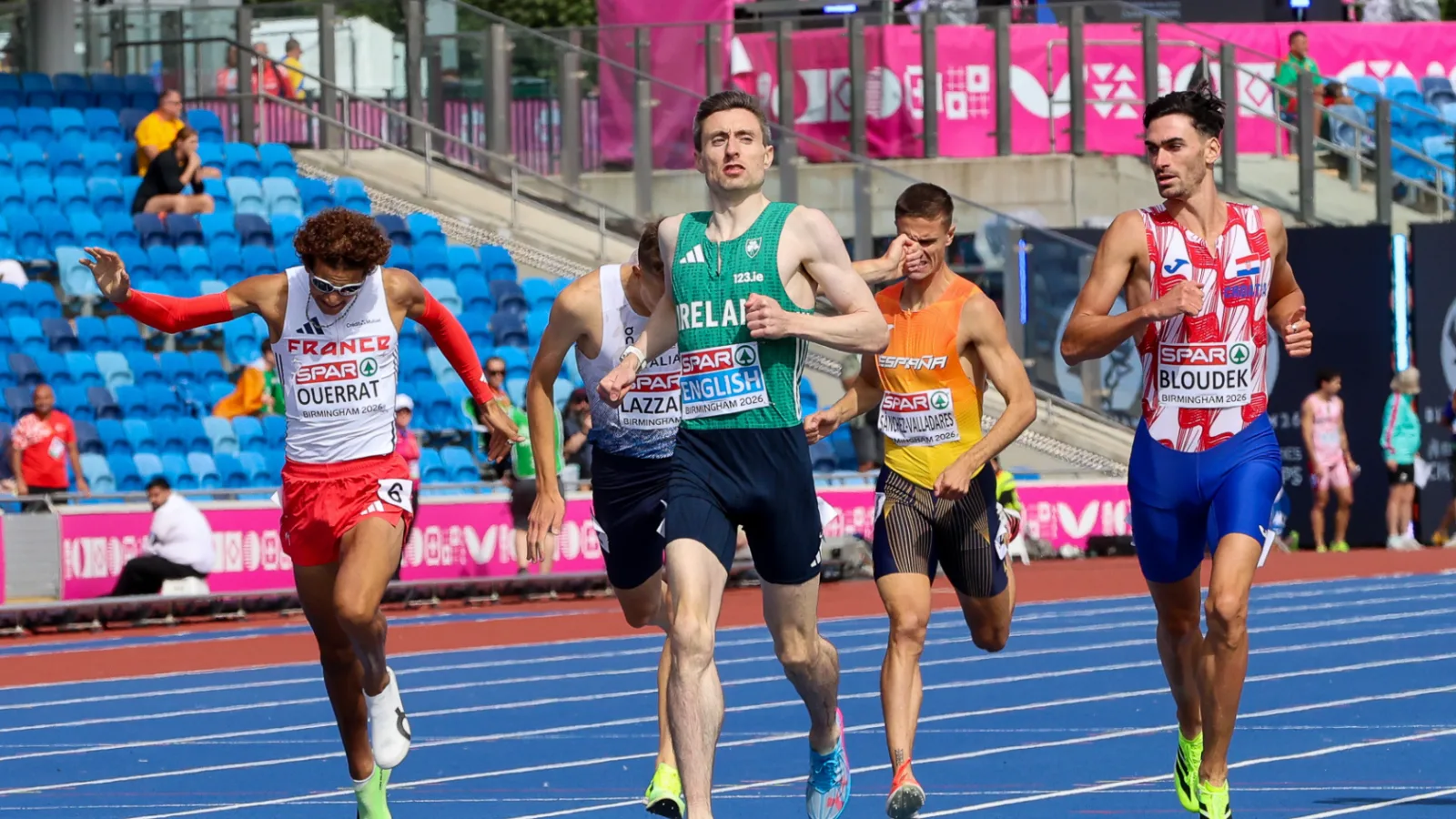
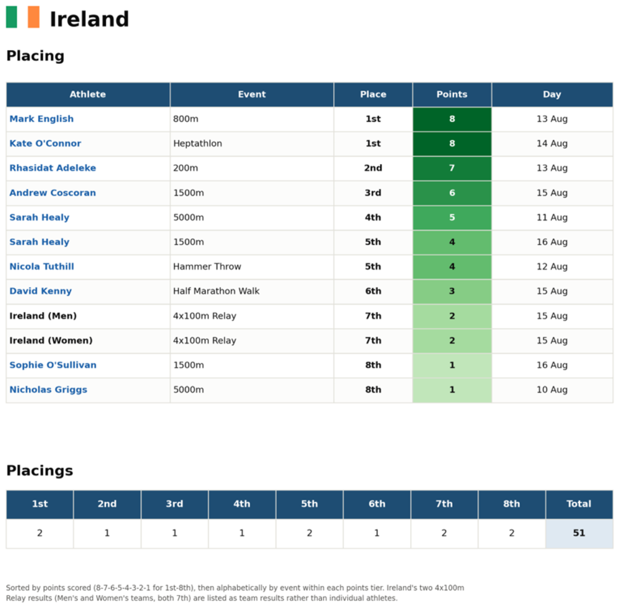
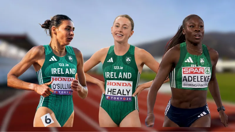
The European championships have not yet receded into the fuzzier alcoves of memory. There are plenty of post championship interviews to be enjoyed and mulled over as the four athletes who medaled tell their stories. There are five other individual athletes along with the two relay teams who deserve kudos in recording top eight finishes. Those results tell us as much about the health of this Irish team as any medal does even if they don't get the same level of media attention.
Ireland's scoring results at ECH26 Birmingham, sorted by points
This analysis, like my prior piece, focuses on Top 8 placings. That does not diminish in any way 10th place finishers Eric Favors in the Shot Put and Jack O'Leary in the 10,000 m, along with Oisín Lane's 11th in the Half Marathon Walk. All are deserving of a shout out as are all who made the team. No small effort was involved in making the trip to Birmingham.
Population and Money
One of my primary interests is looking at factors that may move the needle for Irish athletics, that result in more medals, top 8 placings, and bigger teams.
I decided to examine how population and money may have influenced performance this past week. I focused on the 30 countries that had 10 or more athletes in their squad attempting to discern whether money (in this case GNI/Capita) or population size played a part.
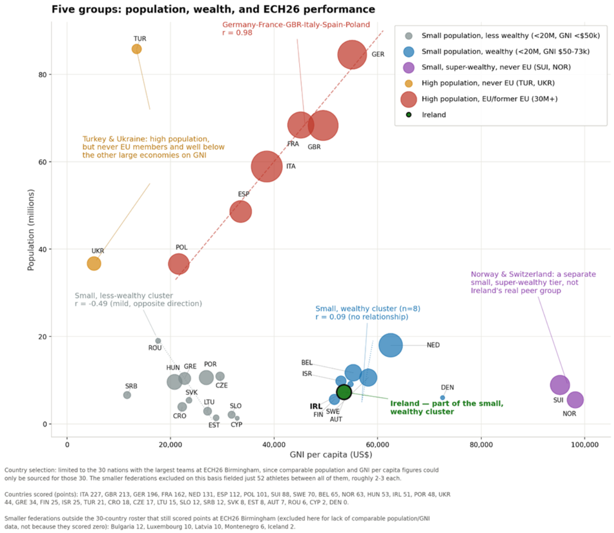
Frequently, it's easier to understand data when plotted on a graph. A good visualization reveals patterns which are less clear when scrutinized in a raw table of numbers. Having gathered GNI/Capita and population data for my target list of countries, I plotted the intersecting points and sized the marker bubble based on the number of placing points scored in Birmingham.
Bringing all this together, an interesting and unexpected clustering emerged which is worthy of attention. I expected large population countries which have a high GNI/Capita would lead the way. But that's not exactly how things panned out.
Five groups — population, wealth, and ECH26 performance, all events
The Population Exceptions
I don't think you need a PhD in statistics to expect that countries with large populations will score more points. Generally, the graph reveals that countries with large populations score lots of points. Look at the plot of the red bubbles. However, there are exceptions. Some large population countries with modest GNI didn't do very well. Turkey, with the largest population in the field at 85.8 million, was outscored 21 to 63 by Norway with a population of 5.5 million.
Small Population Exceptions
Looking at smaller population countries, let's say less than 20 million. You'll see them all clustering horizontally across the bottom of the graph. Note Ireland in the middle and the wealthier Switzerland and Norway to the right. For the latter two countries, they have dramatically outperformed. Perhaps money does count?
Again, there are exceptions: Denmark, with the third highest GNI/Capita, had a depressing championship, not one athlete in the top 8. I imagine uncomfortable discussions might be happening in Copenhagen. The graph also reveals small population, financially constrained countries outperforming others with greater wealth, Hungary, Greece and Portugal clearly exceed Austria.
How Should Ireland View This Data?
Ireland needs to look at the countries in the bottom quarter of the graph. Some are a lot poorer like Hungary who had an almost identical squad size but edged Ireland by 2 scoring points. Not a dramatic difference, but the Magyars with a $20,700 GNI/Capita are doing more with a lot less than Ireland’s $53,472. What can we learn there?
A Side Note
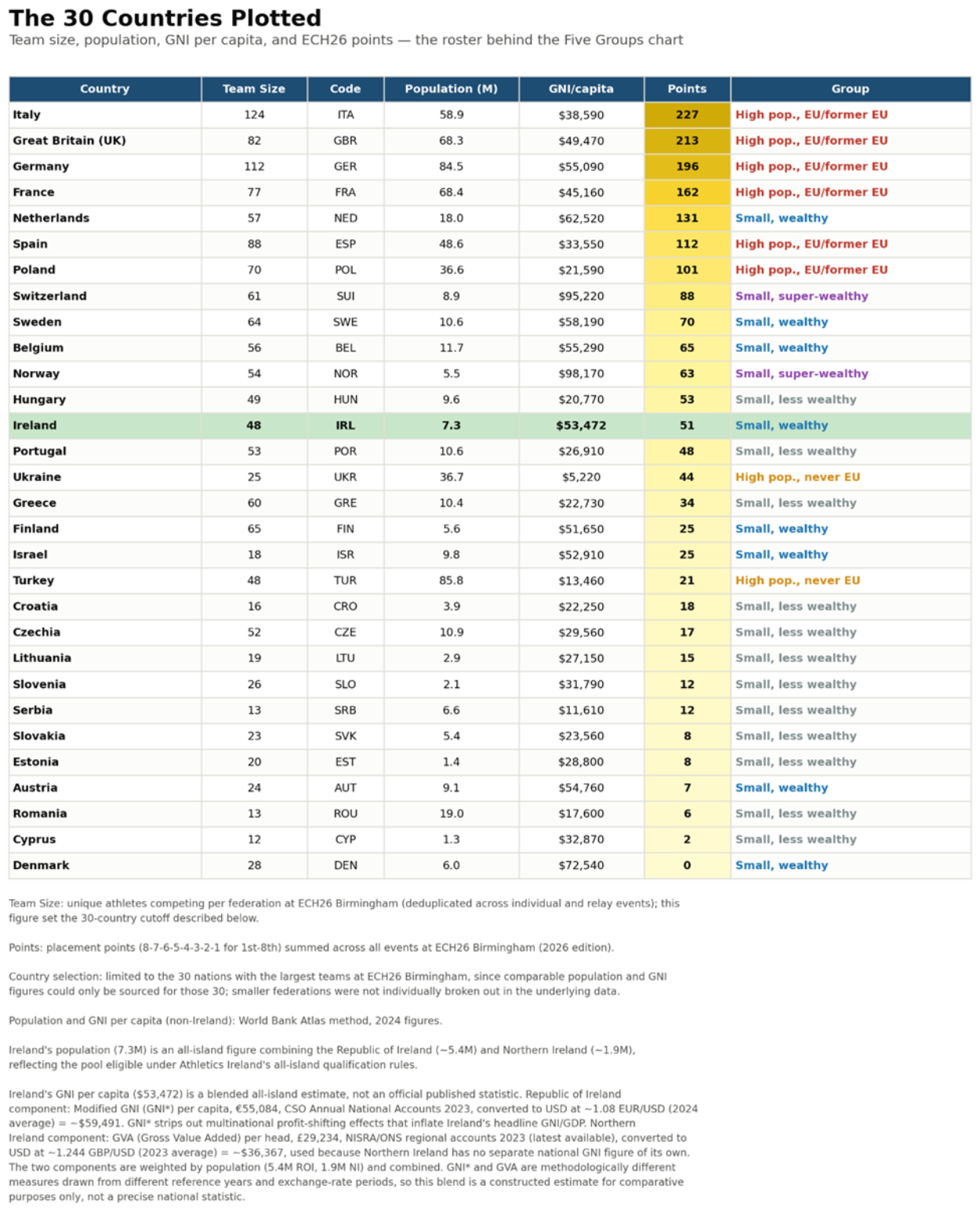
Those that are into economic and demographic data might look askance at Ireland's entry in the table below. The population number of 7.3 million represents the whole island, all of whom could opt to represent Ireland. The GNI/Capita number is an attempt to calculate an all-island metric. It's lower than the Republic on its own. I'll leave more fastidious types to read the table footnotes while acknowledging it is a SWAG. I’m sure a more refined metric could be generated but for now this is a reasonable proxy.
The 30 countries plotted — team size, population, GNI per capita, and points
This graph and the supporting table reveal three country clusters at the bottom of the visualization which Ireland should aim to outperform. What can we learn from other small population countries? Those countries that are poorly resourced may show how to spend money more efficiently. Those with greater financial resources such as Norway and Switzerland may show us the way should more money be funneled into Irish athletics.
In truth, I think Athletics Ireland is performing quite well. That doesn't mean that capabilities have been maximized, there's a lot of room where performance can be ramped up.
What About Funding?
Isn't this all a bit idiotic? Comparing Ireland's performance against other countries without digging into the funding of athletics itself? That's something I'm mulling over, and I hope to explore at a future point. For now, GNI/Capita is a useful marker, revealing the funding potential for the sport in Ireland.